


.png?width=2000&height=1207&name=n.%2024%20cornici%20con%20spessore%204cm%20dimensioni%2033%2c7x25cm%20con%20dentro%20foglio%20A4%20(15).png)
.png?width=2000&height=1207&name=n.%2024%20cornici%20con%20spessore%204cm%20dimensioni%2033%2c7x25cm%20con%20dentro%20foglio%20A4%20(16).png)
.png?width=2000&height=1207&name=n.%2024%20cornici%20con%20spessore%204cm%20dimensioni%2033%2c7x25cm%20con%20dentro%20foglio%20A4%20(17).png)

.png?width=2000&height=1207&name=n.%2024%20cornici%20con%20spessore%204cm%20dimensioni%2033%2c7x25cm%20con%20dentro%20foglio%20A4%20(18).png)

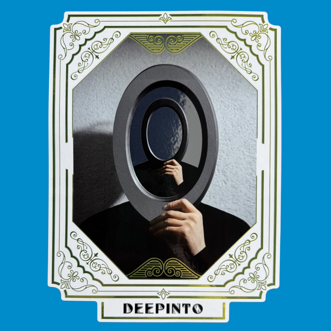
DEEPINTO
A hyper-realistic painting that takes us ‘deep-into’ an unexpected dimension. Exactly like Eurolabel, which examines each project and its design aspects in depth and meticulousness, selecting the materials, printing techniques, and finishing techniques most suited to the finalisation of a label that meets the customer's expectations to the utmost.
DEEPINTO is a game of looks: it challenges us to look ‘inside’, beyond appearance, into a world hidden under the shiny, metallic surface. It is a visual metaphor for the inner depth and mystery that lies behind everything. An invitation not to stop at first impressions, because the true image only becomes clear when you change your perspective.
The label is realised on a white polypropylene with a digital ink-jet printing, finished with an overprinted cold silver foil and a special matt ink with a ‘blackboard’ effect in screen printing.
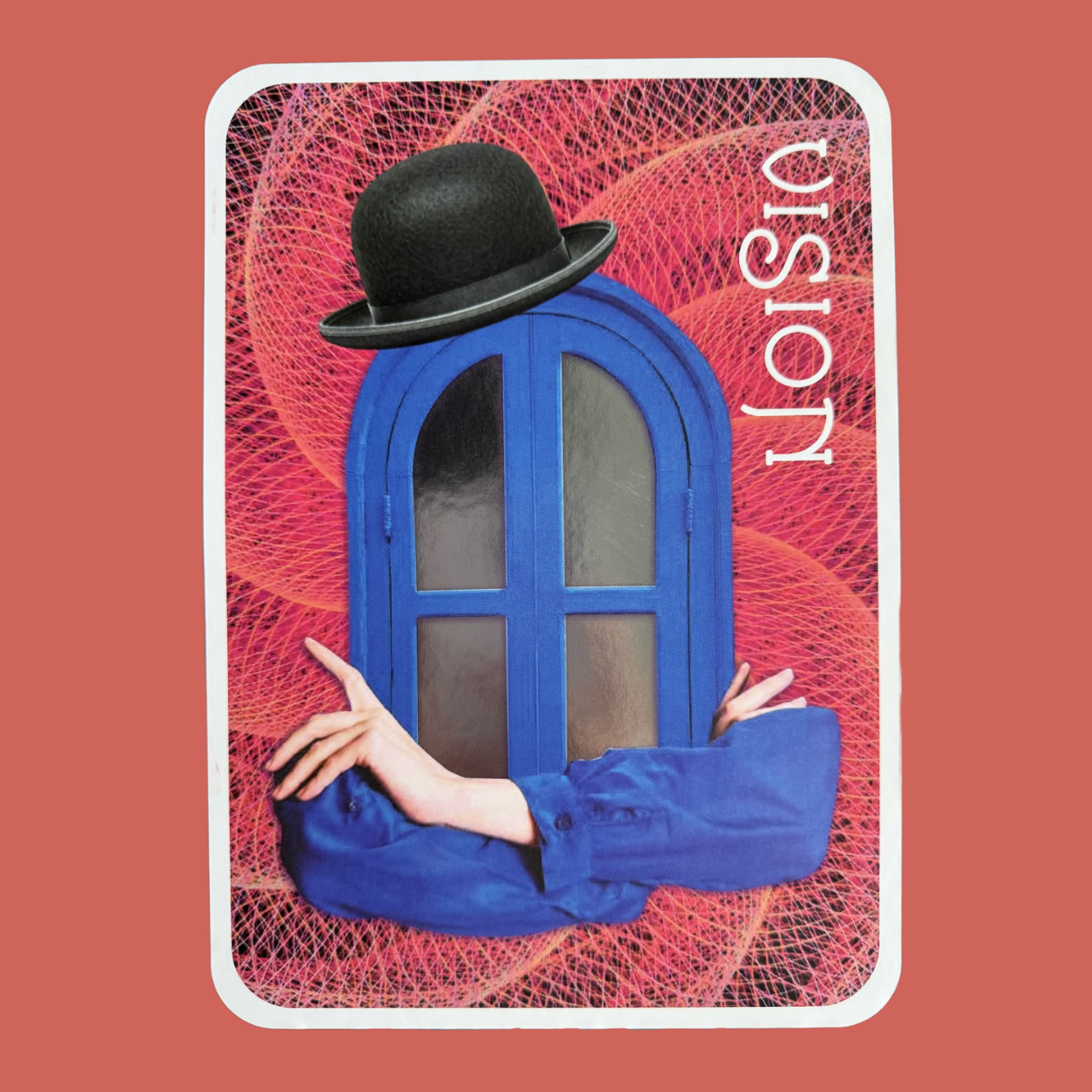
VISION
In any context, ‘having the vision’ of things is fundamental because it allows us to imagine and catch aspects that might go unnoticed. Being visionaries constantly allows us to find innovative solutions and experiment with unexpected processes to achieve unique and effective results, but also to return a visual and realisable interpretation to the interlocutor, highlighting the brand's personality: this is Eurolabel's mindset!
VISION is a window on an alternative reality, representing the act of seeing beyond: imagining, anticipating, reinventing. The artwork recalls the idea of the mind as a multiple lens, capable of transforming light into vision, and vision into innovation.
The label is produced on metallised paper with a digital offset printing, finished with an interplay of glossy and matt flexographic inks.
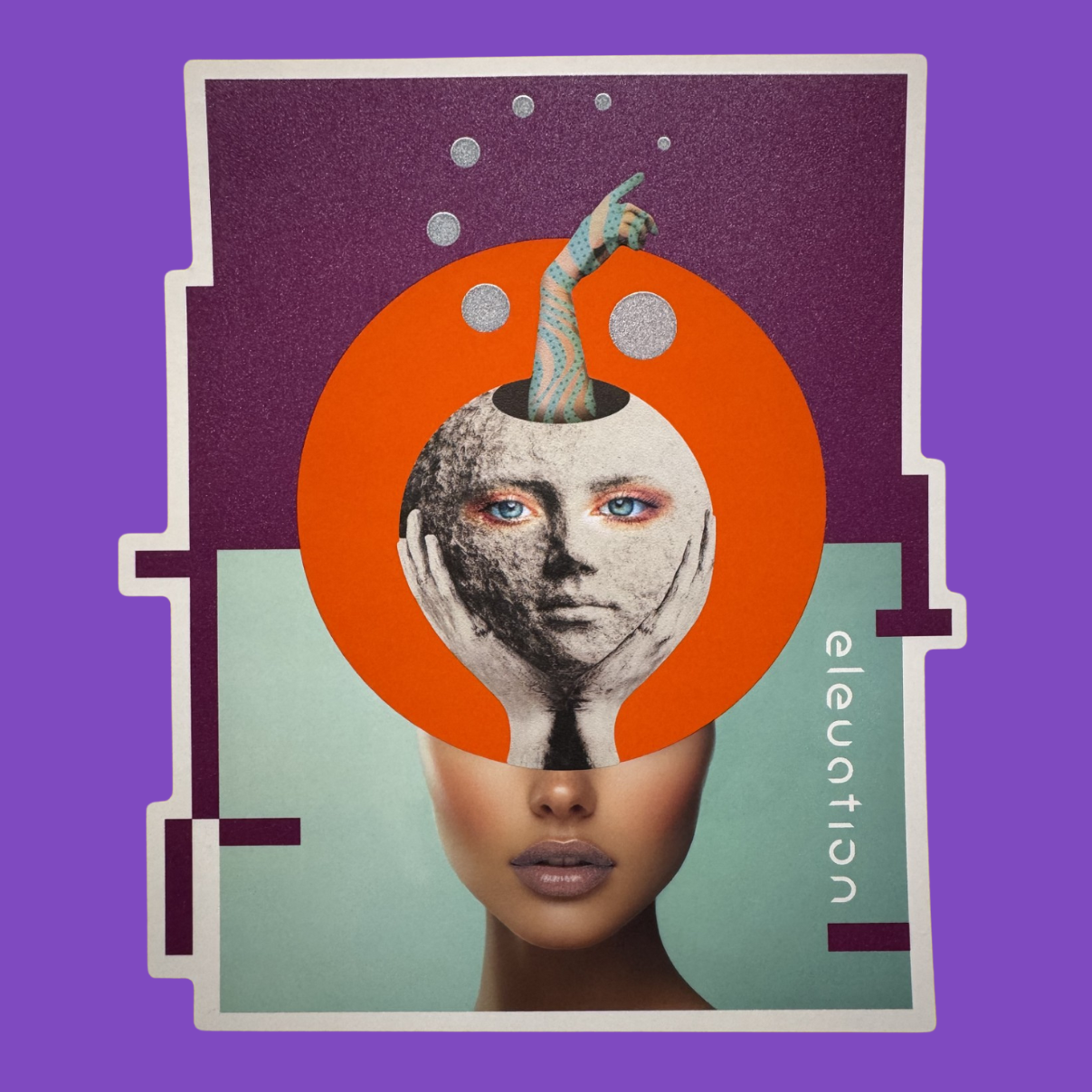
ELEVATION
Elevating to a higher dimension, letting creativity flow and then channelling it towards concrete and constructive actions and processes. This is the modus-operandi that characterises Eurolabel: a mix of creativity and rationality; open minds capable of shaping solid answers, actively contributing to the production of labels with high technical and aesthetic content.
ELEVATION is the sensory ascent, suspended in an ethereal balance of transparencies and glitter. This image wants to convey a sensation of lightness and a verticality of movement, almost spiritual, telling of elevation not as an escape, but as refinement, as a drive that leads beyond the gravity of rules.
The label is realised on a white polyethylene with a digital offset printing, finished with iridescent inks and with a reinserting of a second label realised on a white matt paper with a skin effect.
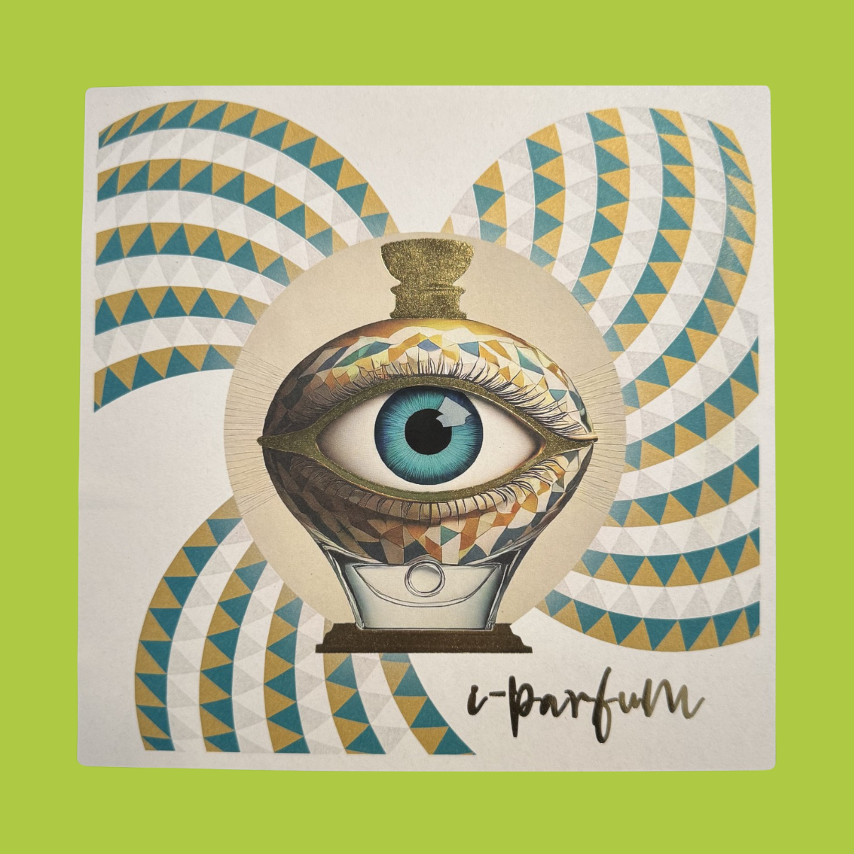
I-PARFUM
From the earliest days of our lives, smells and scents strongly affect our emotional memory, leaving unforgettable memories in us and automatically creating a personal classification between pleasant and unpleasant situations/places/people.
I-PARFUM is a visual synesthesia: an eye that looks, but actually smells. The label is a scent you look at, an image you breathe in. The boundary between senses blurs and the experience becomes multi-sensorial. In this composition, the eye becomes a metaphor for the soul that catches the essence of invisible things.
The label is made on a recycled paper with a smooth texture with a digital offset printing and the use of silver ink, finished with a glossy varnish with rose-scented microcapsules in screen printing and a micro-embossing with a hot stamping gold foil.
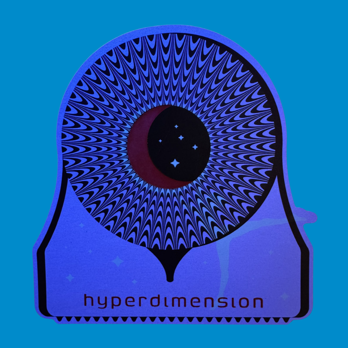
HYPERDIMENSION
By skilfully combining extensive know-how on materials, printing techniques and enhancements, Eurolabel is able to take your labels into another dimension, making invisible elements visible and leading the interlocutor, with special effects selected for each specific need, on a hyper-dimensional journey. Ready to be fascinated?
HYPERDIMENSION is a portal to somewhere else: a living surface that changes and reveals hidden plots. Thermochromic ink and UV details build a landscape that transforms, that reacts. The graphics are a gateway, an invitation to enter a dimension where space and time bend to design and matter becomes experiential.
The label is realised on a recycled pearlescent paper with a digital offset printing, finished with an invisible ink, a thermochromic ink and a high thickness screen printing.
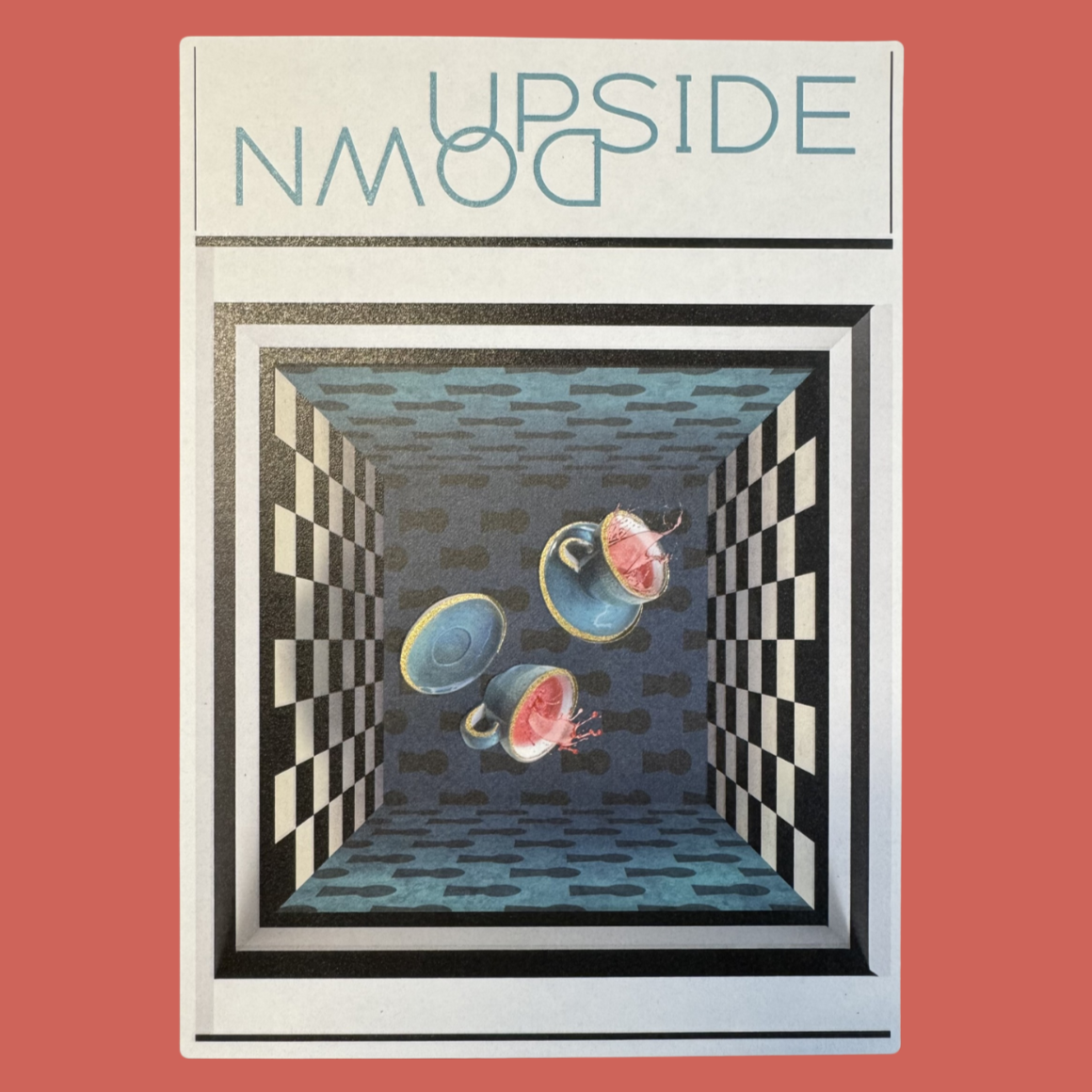
UPSIDE DOWN
Have you ever tried to look at the world upside down? We do, especially when a customer proposes us some ‘Mission Impossible’. In these cases (but not only!) we try to think upside down in order to be able to see new ways out, explore unexpected solutions and get to say ‘Impossible is nothing!’. Satisfaction guaranteed!
UPSIDE DOWN plays with logic: suspended cups, inverted gravity, a domestic world that loses its bearings. The label becomes a visual rebus: normality turns upside down and reveals its hidden wonder. It invites us to look at the everyday from a new perspective, to find the unusual in the ordinary.
The label is realised on a recycled soft white paper with a digital offset printing, finished with a glossy varnish with vanilla-scented microcapsules in screen printing and a hot stamping gold foil.
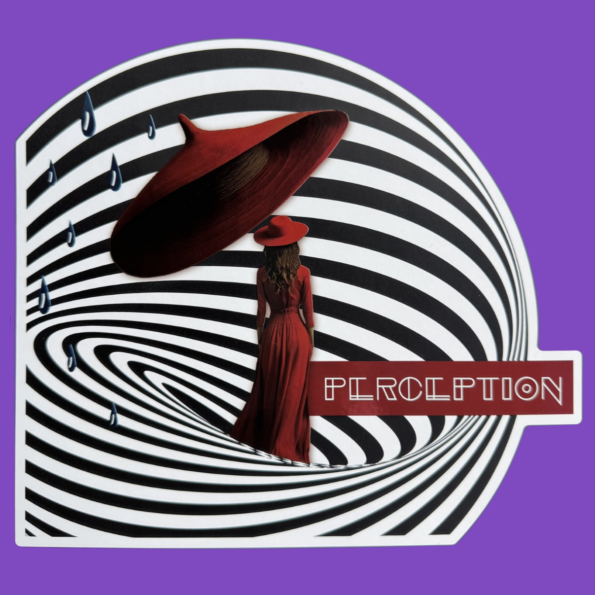
PERCEPTION
For us at Eurolabel, empathising with the customer is fundamental. It is only in this way that we can have the exact perception of what he wants. And it is only in this way that we can technically translate that perception on the label, using enhancements and special effects that amplify the product's assets and determine its purchase by the end consumer.
PERCEPTION explores how we see and interpret the world. Mirrored blue drops, a surface with a play of glosses and mattes: each element is a filter of reality, each reflection a point of view. It is a visual representation of subjectivity and aesthetic sensitivity.
The label is realised on a white polypropylene with a digital inkjet printing, finished with an overprinted cold silver foil and a special matt black ink in screen printing.
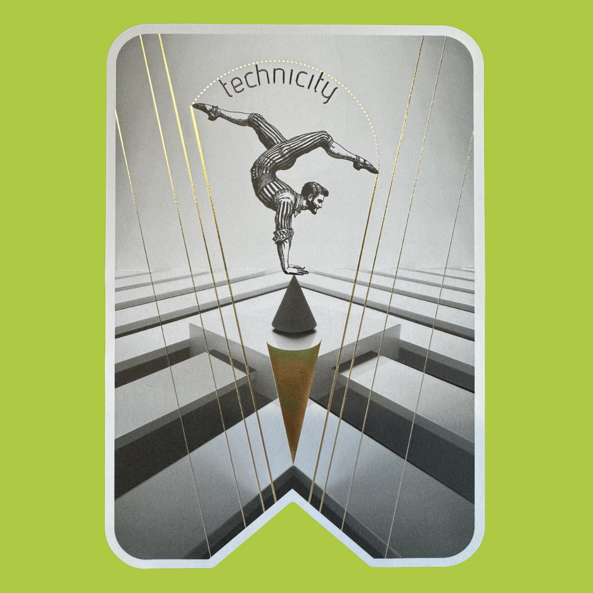
TECHNICITY
To create a perfect label, the idea is not enough. You need experience, precision in execution, knowledge of the context, balanced accuracy, careful evaluation of every detail and in-depth knowledge of production processes. At Eurolabel, technicity has always been an essential part of our work and one of our main ingredients to achieve the perfect label.
TECHNICITY is a celebration of precision: clean lines, gold elements and a paper that looks like fabric. Every detail is calculated, every finish is measured, but nothing is cold. Technique becomes art. Aesthetics intertwines with functionality and proves that excellence comes from attention to detail. It is a tribute to the beauty hidden in rigour and discipline.
The label is realised on a white embossed paper with a digital offset printing, finished with hot stamping gold foil and a glossy screen printing varnish.

